Дата: 30 Яну 2026
The checkout area is rarely a favorite spot for customers. This is where they wait, where they rush, and where shopping comes to an end.
From a retailer’s perspective, however, it is one of the most important areas in the store.
The reason is simple:
the checkout is the final point of contact with the customer and the place where final purchase decisions are made.
That is why it has the potential not just to “process” transactions, but to drive additional sales—when it is organized correctly.
👀 What does the customer experience at the checkout?
While waiting in line, customers usually think about three things:
📍 where to stand
⏳ how long the wait will be
⚡ whether they chose the fastest checkout
At this moment, they rarely search actively for products. Yet this is exactly when they are most receptive to impulse decisions, provided the environment is clear, organized, and unobtrusive.
When the checkout area feels chaotic, cluttered, or confusing, this potential is lost.
🔍 First step: observation and analysis
Before making changes, it is essential to answer a few key questions:
📊 1. How do customers behave while waiting?
What do they look at?
Which products do they reach for?
How long do they wait during peak hours?
These observations reveal:
• which products truly perform
• which simply take up space
• whether the layout supports or hinders decision-making
📐 2. What is the ratio between space and turnover?
The category that occupies the most space is not always the one delivering the best results.
Often, smaller and well-selected products generate higher returns than bulky, low-visibility items. This is a clear sign that the layout can be optimized.
⭐ 3. Which are the leading checkout categories?
In most stores, 2–3 categories account for the majority of checkout sales.
When these are clearly identified and well presented, the checkout area becomes significantly more effective.
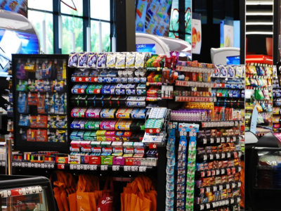
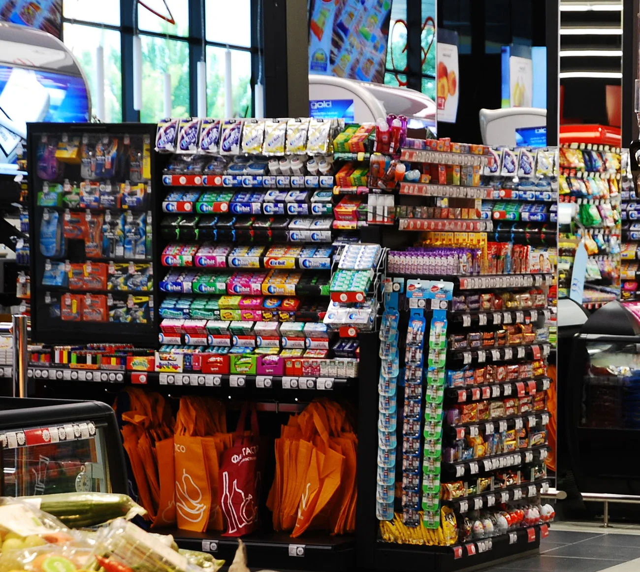
🛠 How to make the checkout area more profitable
🧁 Clear and organized presentation
Impulse products should be:
• highly visible
• neatly arranged
• easy to grab
A structured and upright presentation creates purchase intent and can lead to double-digit sales growth within a category.
🏷 Clear messaging and orientation
Clear price labels and readable signage reduce hesitation.
Customers should immediately understand what is being offered—without effort or questions.
🔒 Security, order, and trust
The checkout area should be secure, well-lit, and organized.
Order creates a sense of control, which directly influences purchasing decisions.
🗣 Active staff recommendations
Offering a “product of the day” or “product of the week” can increase sales of that item by 50–80%, without additional marketing costs.
✅ In conclusion
The checkout area is not just a payment point.
It is an opportunity:
• ➕ for additional sales
• 🙂 for a better customer experience
• 📈 for higher space efficiency
👉 Ready to improve your checkout area?
In our online store, you will find solutions for organizing, displaying, and optimizing checkout areas—from impulse displays to equipment for better organization.
🔗 Explore all solutions in our online store:
https://shopdirect.bg
If you have questions or would like to discuss the best option for your store, contact us—we’ll be happy to help.
Post comment